

Geeking Out About the Comics Medium with Unflattening's Nick Sousanis (Part Two)
/Given the book’s emphasis on getting us to reflect on seeing (and other sensory perceptions) as part of the thinking process, I wondered about your choice to publish the book in black and white rather than in color. Does restricting the color palette force us to more actively work to fill in the blanks? Or would color have added another whole dimension to your argument? Hmmm… My choice was primarily based on economics. Since I print and give away copies of my work all the time, color printing would break me! Also, I think I’m more comfortable working in black and white. It is possible that working in black and white makes it seem more dignified – frequently the pages feel like woodcuts or etchings, and that may align it more with artistic traditions and proto-comics like Frans Masereel or Lynd Ward than the four-colored newsprint Ben-Day dots so negatively associated with comics. Though none of that was my intent.
That said – there were places I really wanted color and it would have helped me! Simple things like the two page sequence (p. 36-7) where I show the green glasses given to Dorothy and co. when they enter the Emerald City (in the book version).

That sequence continues as white light is split by a prism into the spectrum and spot color for it all would’ve been great. My page discussing multimodality (p. 65) would’ve been an entirely different concept had I been working in color.
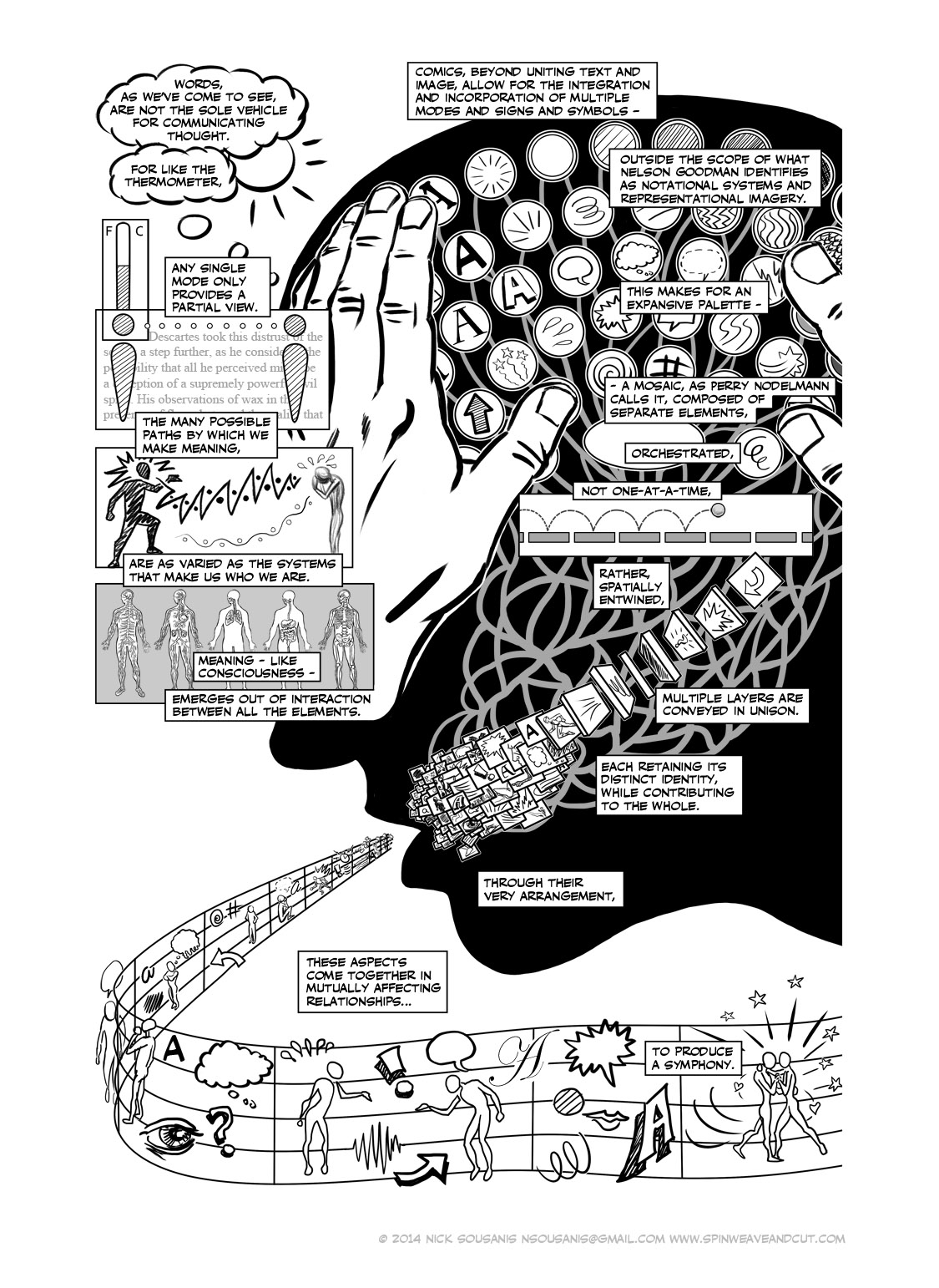
Not having color forced me to invent more complicated analogies. I juxtaposed typewriter keys with an orchestra pit and all the different sounds that can emanate from it – all mapped to expressive fonts and symbols (emanata) we might use in comics.

When I give talks on comics and discuss their multimodal strengths, I always share a page from David Mazzucchelli’s beautiful Asterios Polyp. There he plays with color, artistic style, fonts, and balloon style to great effect. So I can imagine color both enhancing existing pages I did and then radically changing pages based on having a different means of working available to me from the ground up. And certainly given the Oz allusions, it might’ve been fun, if somewhat predictable, to go from the grey opening chapter to increasingly Technicolor pages moving forward.
Sergei Eisenstein once boasted that he could present the arguments of Karl Marx’s Das Kapital via a silent, montage film (but he never actually did so). This claim came to mind for me on several levels as I worked through your book: first, it reminded me that most comic books for instructive purposes focus on concrete elements which can be depicted easily, where-as you have sought ways here to communicate a much more abstract argument (much more like Das Kapital than like the themes that Eisenstein actually did depict through his work.
Second, you do not seek to communicate these ideas through images alone; rather, the work depends on the complex interweaving of words and images (a point you raise many times).
And third, many people have argued that while in a broad sense any idea can be communicated through any medium, there are some constraints and affordances which make some ideas easier to express than others. There are places here where it seems you purposefully set out to do nonfiction comics the hard way, pushing against what the medium did easily, to see where the affordances might break down. Responses?
On the list of things I wish I’d tried/had space/time for – an entirely wordless chapter is near the top, and it is something I intend to do in a forthcoming project. But as far as doing things the hard way – ha! – yeah, I suppose that’s true.
Long before I’d come to the doctoral program, I’d abandoned having a visible narrator to carry my discussion. Using one comes with certain advantages – you always have something to draw! But I felt there was much more to be explored with comics – and making use of the range the medium offers. I think that a visible narrator can often serve as a simple placeholder for the text – and so it becomes a way of making words more easily digestible, more approachable – all of which are certainly good things – but it doesn’t necessarily add something to the words.
I wanted to make comics that present ideas as complex as we form them within our bodies – with all the layers, the uncertainty, etc. I never start with text or a script and then come up with pictures for it. I begin with an idea I want to convey, a question I have, and then try images and text that help me get at it.
The hardest thing here is I never know what I’m going to draw – there is nothing to fall back on. Some ideas suggest images right away and some go through many, many iterations before I arrive at a suitable arrangement of visuals (the initial concept for that aforementioned page on multimodality was of an omelet and all the ingredients mixed into it! I think it would have been productive, but it kept not working for various reasons).
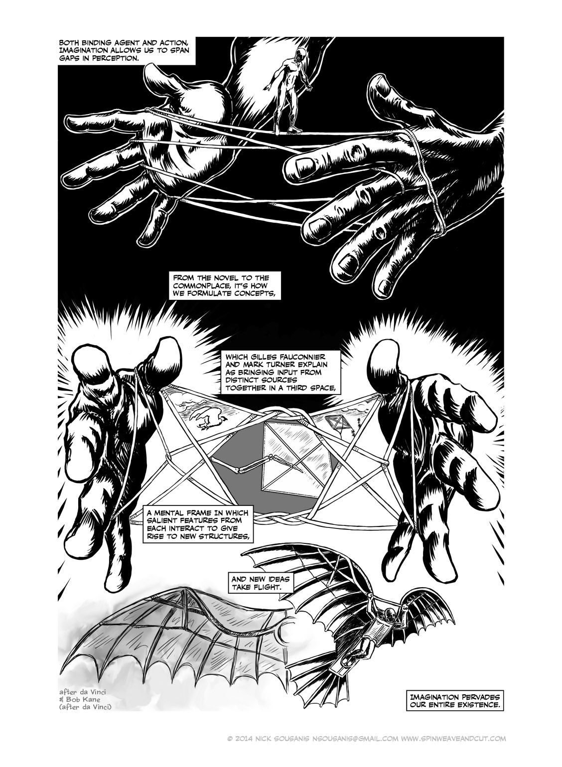
And what’s also key here is that I don’t know what I’m going to say until the whole comes together. For instance, on the page with the tightrope walker/cats cradle (p. 91) – I ended up calling imagination “both binding agent and action” spanning “gaps in perception” – and that was because the visuals suggested that text (a cats cradle binds even as it serves as an active bridge between moments), which ended up being just the right way to talk about what I was doing around imagination.
It is hard, this not knowing what you’re going to do, but it’s exciting. It’s generative. The pages that finally emerge out of the sketching/thinking process so often come as a surprise to me – I really relish that!
Throughout Unflattening, there were the shifts in representational style throughout and often on the same page -- between naturalistic and iconic/stylized images, between concrete and abstract images, between representational and diagrams and maps, between idiosyncratic and shared cultural symbols, and in some cases, between a full page of text and pages much more centered on images. To what degree are these shifts part of your strategy for getting people to think about how and what they are seeing?
Yes, the shifts are entirely intended to do just that! As the central core of this book is seeing from multiple perspectives – literally drawing from multiple perspectives was key throughout. The extreme cases of this were when I altered drawing styles entirely from panel to panel on the faucet and rose pages. What does that mean for me as the maker to draw differently? And how does that affect the reader?
The page of all text is meant to come across as jarring, and reinforce my point. The first chapter is the most consistent in style – dense, almost etched-linework, clearly laborious and involved drawing. I wanted to ensure a possibly skeptical academic audience that I could indeed draw and it’s further designed to be pretty straightforward compositionally for someone with even the most limited experience reading comics.
From there I could, as with the concept itself, start to open things up, and play with more conceptual approaches. Early on, as word of my work was getting out, there was some understandable misconception that it was entirely on comics. It is very much an argument for its own existence and for that of things like it, but only a small part of it is explicitly about comics. However, the whole thing is intended to be a demonstration about what comics can do – so I was very conscious of wanting to highlight the diversity of ways comics can organize and present ideas – in style and composition.
As I said above, the creation of each page begins with an idea, guided by this question – what does the idea feel like? Perhaps even more so than the style of drawing, I want the composition, the reader’s movement to be part of the meaning, and I think in that regard I’m thinking about the connection between comics and architecture, and maybe even comics and dance – how do you move through it, how does it move you?
So each page has an aesthetic style (or range) and a particular flow that feels appropriate to convey the idea. My thoughts to greatly vary my compositions were reinforced early on by a comment from my wife, where she kept looking at pages over my shoulder and saying ‘I’ve never seen a page like that before.’ And so I made a point of not having any compositions repeat in the book!
It’s important to me that comics aren’t simply what we put in the panels (which is why “guided view” comics apps don’t make a lot of sense to me in terms of how I work), but the assembled whole of visual elements. So sometimes I do lean more towards information design because that’s how the idea takes shape. I’m quite interested to study more of information visualization, and see how I can bring that back to comics (in my current course, I have several information visualization students, and I’m excited to learn from them). I think there is much to be gained for comics artists to see what’s going on in these related forms as a way of expanding what comics can be. Why not use every tool at our disposal? And why not make scholarship that is beautiful?
Nick Sousanis received his doctorate at Columbia University, where he wrote and drew his dissertation entirely in comics form. Titled Unflattening, it is now a book from Harvard University Press. He’s presented on his work and the importance of visual thinking in education at such institutions as Stanford, Princeton, UCLA, and Microsoft Research, along with keynote addresses for the Visitors Studies Association’s and the International Visual Literacy Association. He has taught courses on comics as powerful communication tools at Columbia, Parsons, and now at the University of Calgary, where he is currently a Postdoctoral Fellow in Comics Studies.
Nick’s website: www.spinweaveandcut.com